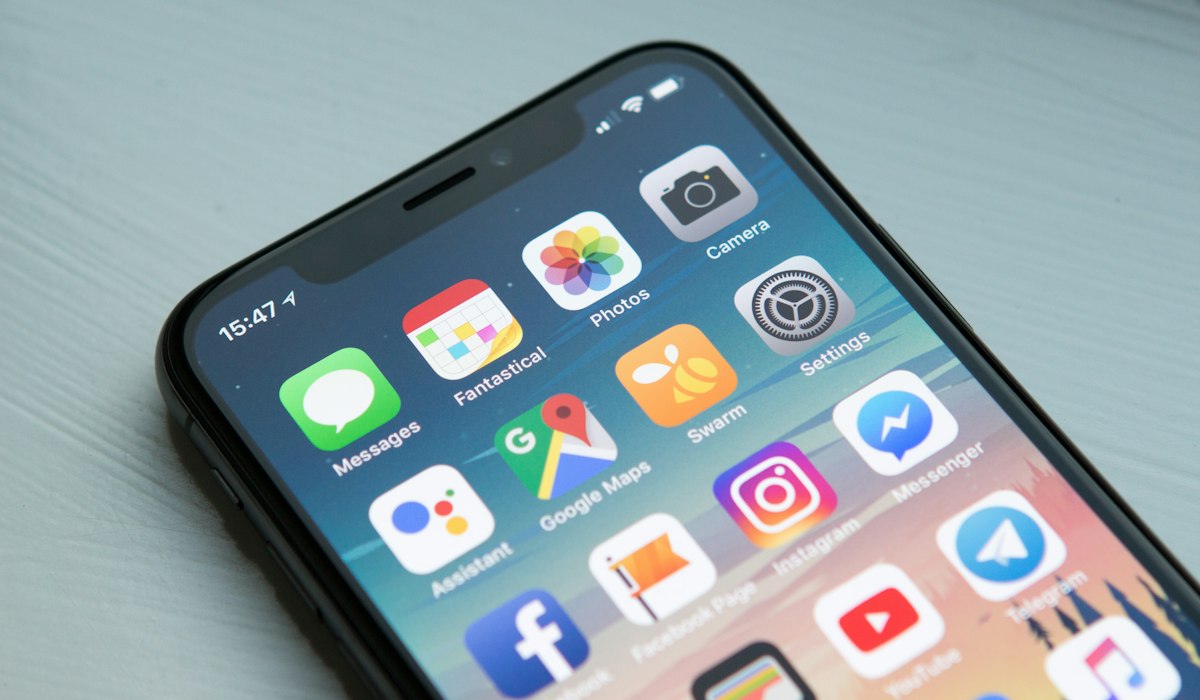
Across the shops we work with, mobile visitors consistently outnumber desktop visitors — often by 4 or 5 to 1. If your website was designed by starting with the desktop layout and 'shrinking it down' for mobile, you're already behind.
What 'mobile-first' actually means
It means the design process starts with the smallest screen, not the largest. Every layout decision — font size, button spacing, image sizing — is made for a thumb on a 6-inch screen first, then adapted upward for tablets and desktops.
Common mistakes with 'shrunk-down' desktop sites
- Buttons and links placed too close together, causing mis-taps
- Text that requires pinch-to-zoom to read comfortably
- Forms with too many fields visible at once, feeling overwhelming on a small screen
- Large background images that slow down load time on mobile data
Google notices too
Google indexes and ranks websites primarily based on their mobile version (a practice called 'mobile-first indexing'). A site that works poorly on mobile doesn't just lose visitors directly — it also ranks lower in search results.
Every ShpLinks website is designed and tested on real phone screens first, not adapted afterward as an afterthought.